What people ask for: charts you can point at
Point at any chart on /officials to see each week's numbers, and the matching kind of help lights up everywhere.
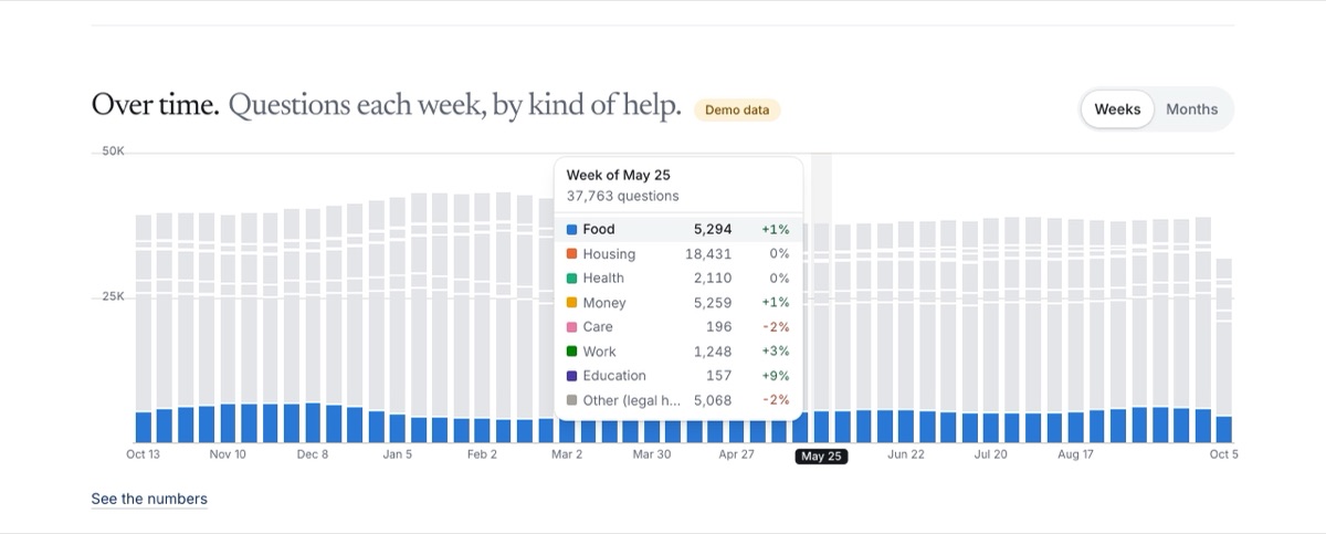
Officials read these charts to plan. Until now a chart showed a shape, and the numbers sat in a table folded under it. Now pointing at a chart shows its numbers.
- Point at a week. A card beside the column lists that week’s total and every kind of help, with its change from the week before. The kind you point at stays in color and the rest turn gray, in every column. localcarehub.org/officials
- The ranked kinds are the legend. Point at Housing in the ranked cards and Housing lights up in the chart above. Point at a state on the map and its row in the list is outlined, and the other way round. A card opens that kind of help.
- Phones and keyboards. On a phone, tap a column to pin its card under the chart. With a keyboard, tab to a chart and use the arrow keys; a screen reader hears each week. Every chart still folds a table of the same numbers.
- Small counts stay hidden. Any count under 10 reads “Fewer than 10” in the cards and the tables too. Demo data keeps its yellow tag on every chart.
- Built to reuse. The charts are one set of parts that the open data pages and the model report will use next. The page loads no chart library and draws the finished charts on the server, so nothing jumps while it loads.